

Lotería Licensed Game Packaging
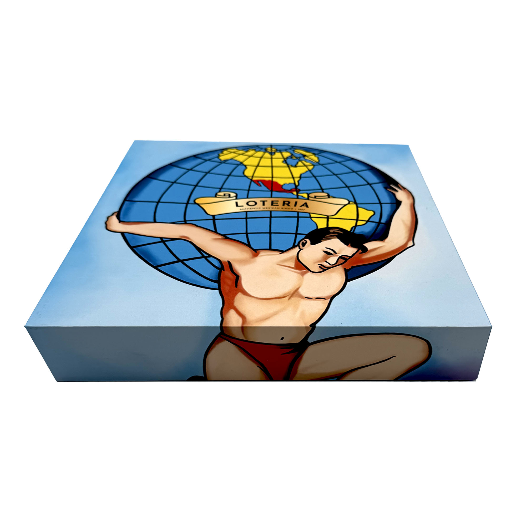
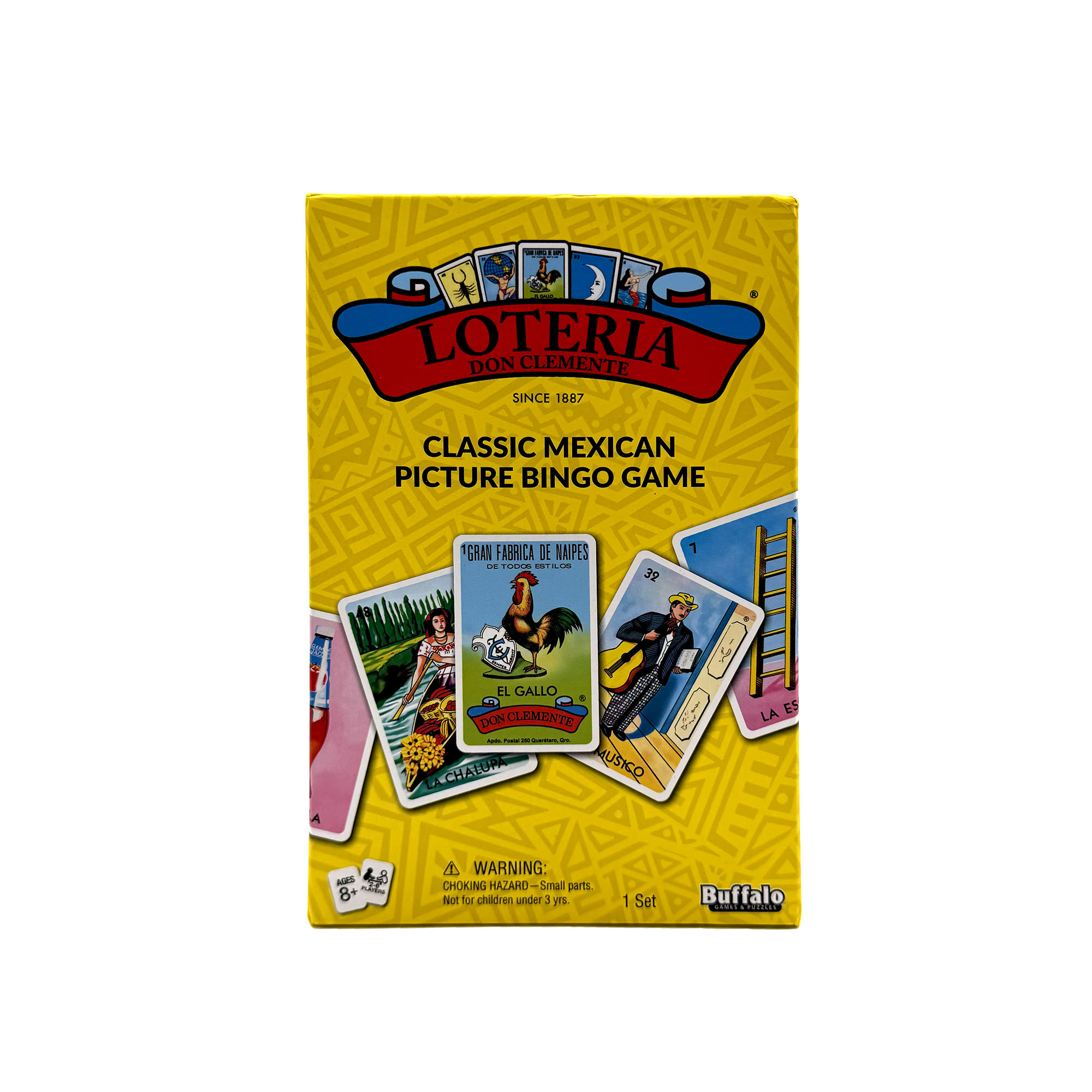
HVRLA produced retail and PR packaging for Lotería, the classic Mexican picture bingo game. The lid carries the familiar illustration of a figure shouldering a globe against a blue sky, and the side panel presents the Lotería wordmark, a playing-card motif, and the descriptor “Classic Mexican Picture Bingo Game” in yellow.
It is the piece in the HVRLA portfolio that shows how we handle artwork that is not our own.
The Brief
Lotería is a heritage property with artwork that generations recognize on sight. The brief was packaging that would work on a retail shelf and as a PR mailer, reproduce the artwork faithfully, and respect every brand standard attached to the license. There was no room for interpretation. The job was fidelity, structure, and a clean rights process.
Licensing Before Design
Licensed packaging always raises intellectual property questions, and the time to answer them is before the first die line, not after the first proof. HVRLA’s licensing and purchasing team managed rights discovery and cost guidance alongside the design work. That meant confirming which artwork elements were cleared for packaging use, which typefaces were part of the brand standard, and where the descriptor and legal lines had to sit.
When several parties hold pieces of a property, this step is what keeps a project from stalling at approval. It is also where HVRLA earns its keep on licensed work; see our services for how the licensing and purchasing team operates.
Structure and Materials
The Lotería box is a two-piece set-up box sized to the game components, with a lid depth that allows a clean lift and a base that holds the cards and boards without rattling. The same structure serves retail and PR use, which keeps tooling to one set and lets the brand send the actual retail unit to press and creators rather than a special edition.
Board weight was chosen for shelf durability first. A game box gets opened hundreds of times over its life, and the corners have to survive that.
Print and Finish
The globe illustration was reproduced from master artwork with color managed against the brand’s reference standards. The yellow side panel is a solid spot color rather than a process build, which keeps it consistent across the run and true to the original. Type follows the licensed standard exactly, including the descriptor line.
A gloss laminate on the lid gives the artwork the enamel-like saturation the original is known for, and a matte base sets the halves apart.
Who This Format Suits
Game publishers, toy brands, heritage consumer products, and anyone packaging a licensed property for retail or press. The same approach applies to music and media packaging, where HVRLA’s roots in vinyl and CD manufacturing mean the rights conversation is familiar ground. For licensed work the structure is often simple; the value is in getting the artwork and the approvals right the first time.
Work with HVRLA
If you hold a license or are negotiating one and need packaging that passes brand review without drama, contact HVRLA. We will walk the rights and the die line together.